Desire Led Navigation
🚀 How Emotionally-Driven Menus Can Skyrocket Conversions
Welcome to a space where every edition delivers insights, strategies, and inspiration to fuel your advertising brilliance. 🤯
🚀 The “Desire-Led Navigation” Playbook: How Emotionally-Driven Menus Can Skyrocket Conversions
Most eCommerce stores treat navigation like a filing system—neatly organizing products into categories like “Shirts,” “Shoes,” or “Accessories.” But this isn’t how people think when they shop. Customers don’t buy products—they buy feelings, aspirations, and transformations.
The smartest brands don’t force users to think logically about their needs—they guide them toward what feels right in the moment. By designing navigation that taps into desires, moods, and emotional triggers, you can create an experience that feels less like shopping and more like self-discovery.
How to Design a Desire-Led Navigation Experience
- Sort by Emotional Triggers, Not Just Product Categories
Instead of breaking products into static categories, create experience-driven pathways based on how customers want to feel.
- Stand Out & Turn Heads (Bold, statement pieces)
- Effortless Everyday Comfort (Soft, breathable, minimal)
- Elevate Your Look (Premium, high-end selections)
This shifts shopping from a product hunt into an emotionally intuitive journey.
- Use Language That Mirrors How People Actually Think
Most brands use industry jargon that doesn’t connect with customers. Instead of “Moisturizers”, why not “ Get That Glow”? Instead of “Running Shoes”, why not “ Conquer Your Next Mile”?
By matching the way customers think and speak, your store becomes instantly relatable and engaging.
- Make Navigation Feel Like a Personal Stylist, Not a Catalog
Guide customers through personalized choices based on mood, intent, or occasion.
- Ask: “What’s your vibe today?” → Offer different style themes
- Use AI or quizzes to suggest collections based on responses
- Create “Shop by Energy” sections that help customers self-identify
When customers feel like your store understands their desires, shopping stops feeling transactional—and starts feeling transformational.
Together with Insense
Find your perfect niche influencers within 48 hours

Fact: Nailin' that creator-brand alignment is the secret to high-performing UGC and influencer partnerships
Problem: Manually sifting through thousands of creators to find the perfect match is a time-consuming nightmare.
Solution: Insense.
You need Insense’s carefully vetted marketplace of 60,000+ UGC creators and micro-influencers from 20+ countries across the USA, Canada, APAC, and Latin America.
Dermatologists for your skincare brand? They’ve got it! Watch collectors? LGBTQ+ creators? They’ve got it!
2,000+ e-com, DTC, and Amazon brands are using Insense to find their perfect niche creators and run diverse collaborations from product seeding and gifting to TikTok Shop and affiliate campaigns, and whitelisted ads.
- Quip - received an 85% influencer activation rate (32/37 influencers posted)
- Any Age Activewear - quickly matched with mature female creators aged 50+ which boosted AOV by 20%
Try Insense yourself.
Book a discovery call by March 14 and get a $200 bonus for your first campaign
🏆 Reel of the Day
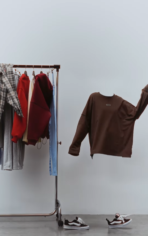
What Works
The use of a green screen technique to create a "floating clothes" effect is a prime example of pattern interruption, a cognitive bias that stops users from scrolling because it disrupts their expected content flow.
This visually unique approach hooks the audience within the first 3 seconds, a crucial window in short-form video marketing.
The effect makes viewers subconsciously think, “Wait, how is this done?”, driving higher watch time and repeat views
The BTS vs. Results format* taps into transparency marketing, making the brand feel more authentic and approachable.
Broader Insights:
Audiences love to see the “making of” content, as it creates a sense of exclusivity and involvement. This is an example of "Show, Don’t Tell" marketing, where the product’s utility and appeal are demonstrated naturally rather than aggressively marketed*.
The placement of the wardrobe hanger in the background is a subtle but effective way to hint at the brand’s full collection without overwhelming the visuals.
Thanks for reading this edition! Keep pushing boundaries, testing ideas, and staying inspired. See you in the next edition with more ways to ignite your marketing success. 🥰